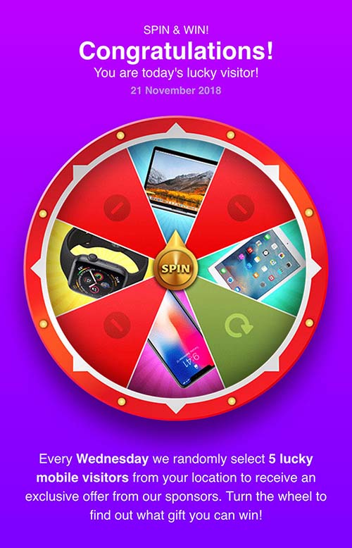
At Traffic Company we get a lot of questions on a daily basis from our partners about prelanders; Should I use them, and if so what kind of prelanders are working well? While the answers to these questions aren't simple, with this blogpost we aim to give you some insights about the use of prelanders.
The 'pre' in prelander
First of all let me explain real quick what a prelander is for those who are unfamiliar with it.
As you know a landingspage is the page that your visitors land on for example after clicking a banner. At one point people started experimenting with putting pages before the landingspage to warm the user up for the actual offer, and that's how the prelander was born.
Even though the prelander ads an extra step in the customer journey, something that usually decreases the conversion rate, in this case it actually causes an increase in the conversion rate. This is because by the time the user reaches the offer he knows what to expect, has shown a certain commitment and is usually more willing to engage in the offer itself. This is also why it's essential to make sure the prelander matches the actual offer. Here at Traffic Company we pay extra attention to this because we know it gives better results right away.

Should I always use a prelander?
The answer to this question depends on the type of offer/product you're promoting. For categories like Dating, Nutra, Finance and Gambling we strongly recommend the use of prelanders. These types of offers often benefit greatly from creating a certain atmosphere that comforts users, tempting them into subscribing or making a purchase.
But of course prelanders aren't always the holy grail and they have their downsides. For example, at Traffic Company we've tested the value of prelanders with mobile content offers several times without success. For these kinds of verticals you want to keep the customer journey as short as possible, especially with click flow offers. With every extra click or page load you're running the risk of losing visitors.
Also there are some advertisers that just aren't that fond of using prelanders because some publisher tend to get a bit too 'creative' with prelanders. This involves making use of unethical practices like misleading users in order to improve performance.
We always recommend you to try it and compare results. And if you're unsure just ask your Account Manager for advice!
Five basic rules that make a great prelander
At Traffic Company we have a few basic requirements that each prelander should have.
Rule 1:
The prelander should follow the AIDA model (Attention → Interest → Desire → Action).
Rule 2:
It needs to look fancy in order to make sure the user doesn't close the page.
Rule 3:
The page should load quickly. Nobody likes to wait, so it should appear almost instantly.
Rule 4:
The prelander should match the offer, this is very important.
Rule 5:
Optimisation is never finished, so keep tweaking it in order to achieve the best results!

Excited to work with prelanders? Just contact your Account Manager at Traffic Company and we can help you to get started!
Tip for our publishers: Since not all of our publishers have an in-house design team, they can ask their Account Manager for a custom-made prelander. We usually deliver within 24 hours, free of charge!


